Building Your VISUAL VOCABULARY
Everything Everywhere
Building your "visual vocabulary" can help your
creative juices
flow. Your visual vocabulary
is all the images you have seen, plus
the associations that go along with them.
Designers need inspiration and often 'borrow'
from various sources. I once heard "nothing is new, it's only new to you". That's
carte blanche for stealing ;) if I've ever heard it!
To keep current, graphic designers have to be looking at everything everywhere, otherwise, we will not be aware of the associations being created
in popular culture—especially those being created in the minds
of future clients—and we will miss out on important new sources of
inspiration and communication.
The Creative Spark
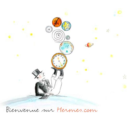
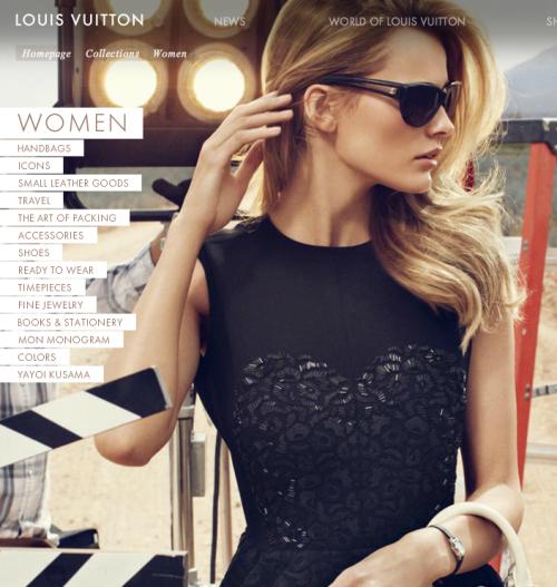
For example, if you have an upscale client, it's a good idea to look at
the websites and latest marketing campaigns of various high-end
brands (such as Hermes, above, or Louis Vuitton, below) to see what they have in common, and to see
where your client is
already looking. Often, because you have an existing logo plus the client's requirements in your mind as you
look, something clicks. The creative spark is there. It can be as
simple as seeing something someone else created, and knowing you can
adapt that and it will be perfect precisely because of the association
that comes along with it,
or, you can get a totally new idea that fits your criteria.
When it's Good, it's Good
Working with a client is easier when you have similar tastes, but if you
don't, you need to understand what the client is looking for, and
intentionally use enough of your shared associations so that they make
the connection. If you find yourself having to explain the
associations you think people will make with what you've designed
because your client doesn't get it, that's proof it won't
work. If your client doesn't get it, they will expect nobody else
will either. However, when you get it right, everyone
will already make the connection, and then you'll know it's good.
When it's Bad, You Know
My favorite associations are those made with color. We all make these connections.
For example, no one
would (should) wear red to a funeral. There is a fine line between bold and
creative, and wrong and out of place. Where is it okay to use a
fluorescent green, and where would it make you think, "Eew, no"! In other words,
you have to know when to stay inside the
box, and when you have to break out and say "No, you can't make
the background of your website such a bright green. It's been
featured on 'Websites That Suck'."
Bless The Box
It's a rare delight to have a client
trust you completely. Most of the time, you have to work within the
box of what the client wants. Part of what your expertise should be,
and what you get paid for is, understanding what is right for the
client when they are unable to communicate it specifically. Sometimes, you might be thinking to
yourself that you disagree with their choices, but you still have to give them what they want.
"The Box" is everything the client tells you they must have. How you
satisfy that gives you some flexibility.
The Customer is Always Right
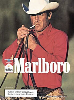
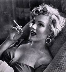
It's a really difficult thing to talk someone out of
something because of a negative visual association they were unaware
of (like the indelible Marlboro Man), but you have
to protect their image. Also, don't forget your work
represents your image as well as theirs. Don't stay inside the box
when you feel it's the weaker choice, but you should always give
them what they want first. You'll look good for pleasing them,
especially if you get it 'right'. If trying what they want just
demonstrates how 'wrong' it is, then they will be able to see that it's wrong
because you will have something (like the blinding green
mock-up above) to show them how and why it
doesn't work. That way it won't seem like you
just didn't want to take the time to try what they wanted. A little
humility goes a long way in establishing your credibility. So how do
you proceed when you don't think what they want is right for them?
Until He's Wrong
It's a graphic design occupational hazard
that everyone's a designer. Most times when the client feels strongly
that they know what they want, it's been my experience they
really don't, until they see it. Sometimes it's like a
puzzle. They have a few pieces but can't see the bigger picture, or
those pieces belong to a completely different puzzle. Use
those pieces to take them to the picture you want them to
 see.
Although taste is subjective, there can be some truly 'wrong'
choices. Sometimes you may feel the client has 'bad' taste, or they
might insist on something
you know will be inappropriate, or maybe just less effective. Sometimes the two of you are just not a match.
Bottom Line: Just be sure you do something you are proud of, or
don't do it. If you're really good, in addition to giving them what
they want, you can make them want what you give them. Working
inside the box can be as liberating as going outside. Like
that
infamous
definition "I know it when I see it", you
also have to know when the solution can only be found outside the
box of what the client can communicate.
see.
Although taste is subjective, there can be some truly 'wrong'
choices. Sometimes you may feel the client has 'bad' taste, or they
might insist on something
you know will be inappropriate, or maybe just less effective. Sometimes the two of you are just not a match.
Bottom Line: Just be sure you do something you are proud of, or
don't do it. If you're really good, in addition to giving them what
they want, you can make them want what you give them. Working
inside the box can be as liberating as going outside. Like
that
infamous
definition "I know it when I see it", you
also have to know when the solution can only be found outside the
box of what the client can communicate.
Breaking The Box
When your client tells you what they
want, and you understand the associations they think will be made
with their suggestion, this gives you a head start to wow-ing them.
If I can see right away that what they want won't work, but that I
can use it in an outside-the-box way, I do exactly what they want just to
compare it to what I think they will like better. This almost always
works! When it doesn't, just give up (I'm kidding). If
you remember the client
is always right and present the
outside-the-box version as being inspired by them, they might be
more receptive than if it seems like "Here's what you wanted, but
here's what I did to make it better." It can't be presented
that way. I believe strongly that if it's better, it's obvious, and
if it's not better, keep working. If the client is design-minded, you have to respect
(not resent) that, and use it to both your advantages.
 Beyond
The Box
Beyond
The Box
It might be an intuitive thing. I had a client tell me their first
instinct for an accent color on their website was bright lime green
but when they got together with their group of advisors, they ruled
that color out. I heard what was said, but what was between the
lines was that what they wanted first was lime green.
They even went so far as to tell me not to bother trying the green.
I did several versions of a website mockup for them and when I was done, I made one more version (off the clock) in that bright green. When I made my presentation and was done showing them the other colors, I pulled out the bright green last, and it clicked. It was really what they wanted all along but they over-thought it, and got away from their original inspiration. Whatever their reasons for not feeling confident in that color choice, I was able to dispel by showing them not only their mock up in that green, but that same green in several other high-end websites that appealed to them. The site is still live and the accents are still green.
It's a great feeling making your client happy. Keep building your visual vocabulary so you can elevate their choices, and exceed their expectations. The more you see, the more tools you will have to use.
__________________________________
If all else fails . . .
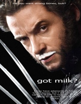
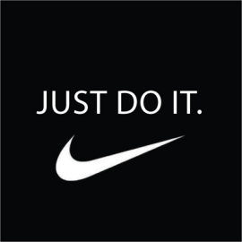
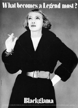
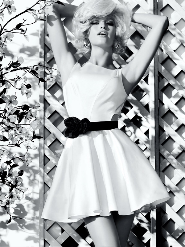
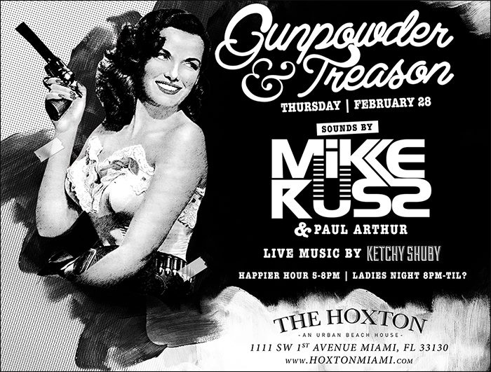
The easiest association and probably one of the most common is Celebrity.
|
Recent Posts |
Building Your Visual Vocabulary
Twitter News:
Quick Promote and
Google Search
Understanding
Image Sizes
and
File Types
The
Prevalence, Appeal, and Use
of Graffiti-Inspired
Images
4 Key Components of Graphic Design
How To Be A Better Blogger Or How To Start If You're Still Just Reading
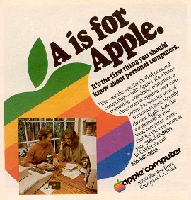
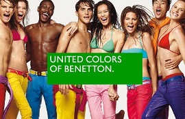
Classic Ad Campaigns
.jpg)